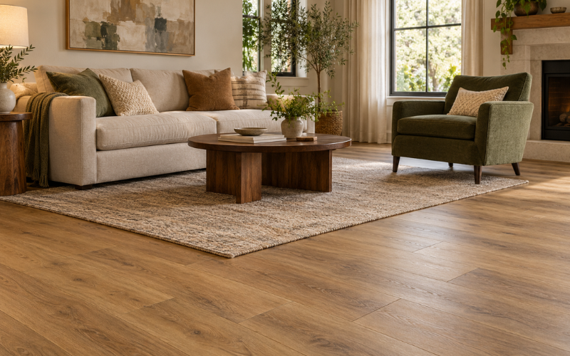
A couch can still be comfortable and well made while making the living room feel older than you would like. Sometimes the problem is its color. More often, it is how that color works with the walls, flooring, lighting, and furniture around it.
When people talk about outdated living room couch colors, they usually mean shades or color combinations that remind them of an earlier decorating style. A cool gray couch in an entirely gray room, for example, can create a different impression from the same couch surrounded by warm wood and soft cream textiles.
Small details matter, too. An undertone—the subtle hint of another color within a shade—can make beige appear pink or gray look blue. Upholstery texture, fading, and the couch’s shape also influence what you see.
No couch color has a fixed expiration date. Before replacing a sofa you otherwise enjoy, look at why it feels dated and whether a few thoughtful changes could help it belong in your room again.
Cool Gray Couches That Leave the Room Feeling Flat
Cool gray can become difficult to work with when nearly everything around it has the same cool tone. A blue-gray couch beside pale gray walls, gray flooring, and silver accessories may leave the room with little contrast. Instead of feeling calm, the space can appear flat or chilly.
Matching furniture can strengthen that impression. When the couch, armchair, rug, and curtains are similar shades of gray, their individual shapes and textures become less noticeable. The room may feel more like a coordinated furniture display than a space that has developed naturally.
Before changing the couch, introduce some warmth around it. A wooden side table, an oatmeal throw, or a cream curtain can soften the overall effect. Muted rust or earthy brown cushions may also work, depending on the particular gray and the other finishes in the room.
The aim is balance rather than covering every gray surface. Keep some of the original color visible, then add differences in texture and lightness. A woven rug and a matte ceramic lamp, for instance, give the eye something to notice beyond a single repeated shade.
Check these changes under your usual evening lighting as well as daylight. The couch may look noticeably cooler or warmer as the light changes.
Dark Brown Couches That Overwhelm the Space
A deep chocolate couch can bring warmth and richness to a living room. It becomes harder to balance when it occupies a large part of the view, particularly in a room with limited daylight or dark flooring.
Shape often contributes as much as color. A brown couch with thick arms, a high back, and a heavy base can appear more imposing than a similar shade on a smaller sofa with visible legs. Add dark wooden tables and another large brown chair, and several substantial pieces begin competing for attention.
Lighter surroundings can make the couch feel more settled. Warm off-white walls, pale curtains, or a rug with a light background create separation between the furniture and the room. This gives the couch a clearer outline instead of allowing it to merge into a dark area.
Choose these lighter shades with the brown itself in mind. A reddish brown may need a different cream from a cooler, almost charcoal brown. Bring samples close to the upholstery before making a larger change.
You can also reduce visual weight without changing the color scheme. An open-sided table or a less crowded arrangement beside the couch can help. The brown remains a central feature, but it no longer has to share space with several equally heavy elements.
Beige and Tan Couches With Difficult Undertones
Beige and tan are often treated as colors that match everything. In practice, they can contain noticeable hints of yellow, pink, orange, gray, or green. Those subtle differences become easier to see when the couch sits beside another neutral surface.
A pink-beige couch may look slightly out of place against a wall with a greenish cast. An orange-tan sofa beside similarly orange flooring may make the whole room feel warmer than intended. Neither surface is necessarily unattractive, but the combination can draw attention to an undertone you had not noticed before.
This is the difference between a useful neutral and a poorly matched one. A neutral works well when it relates comfortably to the surrounding finishes. Being pale or understated does not automatically make it a suitable match.
To assess an existing beige couch, place a few fabric or paint samples beside it. Compare them in daylight, keeping the flooring visible. This makes it easier to judge whether you prefer a gentle match or a clearer contrast.
A patterned cushion or rug can sometimes connect finishes that feel separate. For example, a design containing the couch’s beige, a little of the floor’s brown, and a soft accent color may help the room feel more coordinated. Avoid adding several almost-matching beiges in the hope that they will blend; their differences may become more obvious together.
Burgundy, Mustard, and Teal Couches With a Strong Era Association
Burgundy, mustard, and teal have distinctive personalities. They can also bring familiar decorating styles to mind, especially when paired with furniture and accessories that repeat the same associations.
A burgundy couch surrounded by dark wood, heavy patterned curtains, and ornate gold details can create a strongly traditional impression. Mustard upholstery alongside several orange and brown elements may suggest a retro room. Teal paired with shiny silver furniture and bold geometric accessories can feel tied to a particular decorating approach.
These combinations are not automatically unsuccessful. An intentionally vintage room can be attractive and personal. The difference is whether the pieces appear chosen to support a clear idea or collected without much attention to how they work together.
If the room feels busy, keep the couch as the main color statement. Burgundy might sit comfortably with warm off-white and restrained wood tones. Mustard can be balanced with cream and small touches of charcoal. Teal may work with sandy neutrals and natural wood. Treat these as starting points to test, since each shade varies.
You do not need to repeat the couch color throughout the entire room. A small amount in artwork or a patterned textile can provide enough connection.
Simplifying the surrounding palette lets a strong couch color look deliberate. It also makes it easier to enjoy a shade you already like without building the whole room around a past decorating formula.
What Makes a Couch Color Look Dated Beyond the Shade
Sometimes a couch appears dated because its color has changed unevenly. Sunlight can fade exposed upholstery, while daily use may leave some sections darker or more worn than others. The result can make a once-consistent shade look patchy or dull.
Compare an exposed area with a less exposed section, where accessible. A clear difference may suggest fading or wear rather than a problem with the original color. Cleaning might improve surface dirt, but it will not necessarily restore lost dye. Follow the manufacturer’s care instructions before trying any treatment.
Fabric finish also affects the impression. Shiny upholstery reflects light differently from matte fabric, so folds and worn areas may stand out. The same brown or gray can look quite different in smooth leather, brushed fabric, or a coarse weave.
Patterns and trim add another layer. A busy print or strongly contrasting piping may make the couch feel more tied to a particular style than its base color alone. Yet neither detail is inherently dated; both can work when they relate to the rest of the room.
Consider the couch’s outline as well. Large rolled arms, deep tufting, and a skirted base create a different effect from narrow arms and exposed legs. Before deciding that the color is wrong, ask whether the shape, condition, or fabric is doing more to create the impression you want to change.
Refresh an Outdated Couch Color Without Replacing the Sofa
Start with a small change that you can judge easily. Remove the existing cushions and throws, then look at the couch on its own. Accessories sometimes exaggerate an unwanted undertone or make a strong color feel busier than it needs to be.
Choose new textiles that relate to the upholstery without copying it exactly. A cool gray couch might benefit from warm cream and muted earthy accents. A tan couch may look more balanced with soft off-white and a deeper contrasting shade. The right combination should also make sense beside your flooring and walls.
Texture can be as useful as color. A woven cushion or a soft throw introduces variation while keeping the palette simple. Use enough to make the couch comfortable and inviting, rather than trying to hide every visible section of upholstery.
Next, look at the larger surfaces nearby. A rug can create a useful boundary between a dark couch and dark flooring. Curtains can soften a strong wall-and-sofa contrast. If you are considering repainting, test the wall color directly behind or beside the couch before committing.
A slipcover is another option when the sofa is comfortable but smaller changes do not achieve the result you want. Check the couch’s dimensions, arm shape, and cushion arrangement carefully. A poor fit can bunch or shift, while a suitable cover can give the upholstery a more consistent appearance.
Choose a fabric that suits everyday use, including its washing instructions and how easily it shows marks. You are changing a large surface, so review a sample if possible rather than relying only on a small screen image.
Choose a Replacement Couch Color That Suits Your Room
If you decide to replace the couch, start with the room’s existing finishes. Flooring, fireplaces, built-in furniture, and other surfaces that you intend to keep should help guide the choice. A color that looks appealing in a showroom may behave differently beside them.
Think about which parts of the room already stand out. If the rug and artwork contain strong colors, a quieter couch may give them space. If the room is mostly neutral, a deeper or more colorful sofa can become its main feature. Neither approach is automatically more lasting.
Ask for upholstery samples large enough to assess the weave and shade. Place them where the couch will sit, then check them in the morning, afternoon, and under evening lamps. Hold them upright as well as flat, because light reaches the back and seat of a sofa differently.
Compare the samples with both the wall and floor. A shade that looks neutral by itself may appear pinker, greener, or cooler beside another material. Photographs can help you remember options, but make the final judgment in the room when possible.
Daily use matters alongside appearance. Very pale fabrics may show dark marks clearly, while dark upholstery can make light lint or pet hair noticeable. Color alone does not determine how easy a couch is to maintain; fabric construction and care requirements matter too.
Finally, choose a color you enjoy rather than one you have been told will never go out of style. A well-coordinated personal choice is more useful than a supposedly timeless shade that does not suit your home.
Conclusion
Outdated living room couch colors are often a matter of context rather than a list of shades to avoid. Cool gray can feel flat in an entirely gray room, dark brown can look heavy beside other large dark pieces, and beige can feel awkward when its undertones clash with nearby finishes.
Before replacing your couch, identify what is creating the impression. The issue may be fading, fabric shine, matching accessories, or the balance of light and dark around it. A different rug, simpler cushions, or a suitable slipcover may be enough.
If replacement makes sense, compare fabric samples in your own room and choose a color that works with the surfaces you plan to keep. The goal is a living room that feels comfortable and thoughtfully put together, with a couch you still enjoy using.
FAQs
1. Are gray couches outdated?
Gray couches are not automatically outdated. They can feel flat when surrounded by similar gray walls, flooring, and furniture, particularly if everything has a cool undertone. Wood, warmer neutrals, and varied textures can bring more balance. Judge the whole room before deciding that the gray upholstery needs to change.
2. Can a dark brown couch look good in a light living room?
Yes. A dark brown couch can provide a clear contrast against lighter walls and textiles. Pay attention to its size and shape, as a bulky sofa may still dominate the room. A light rug, uncluttered surroundings, and furniture with more open shapes can help balance its visual weight.
3. Which couch color is least likely to look dated?
No couch color is guaranteed to stay in style. A shade that works with your flooring, walls, and personal preferences is usually a more dependable choice than one selected only because it is popular. Simple coordination and well-maintained upholstery can matter more than whether you choose a neutral or a stronger color.
4. How can I update a couch color on a small budget?
Begin by rearranging cushions and throws you already own, then consider one addition that improves the color balance. A textile that connects the couch to the rug or walls may help more than several unrelated accessories. If you want a larger change, compare the fit and cost of a slipcover before replacing the sofa.
5. Should I replace a couch just because its color feels outdated?
If the couch is comfortable, supportive, and in good condition, try adjusting its surroundings first. Replacement becomes more reasonable when the color bothers you alongside other problems, such as worn upholstery or uncomfortable seating. Assess those issues separately so that a change in decorating taste does not drive the entire decision.